Internal record · Design & Product
The Munsit web app revamp, stage by stage
What the product contained at each stage between 6 August and 4 September 2026, who produced it, and what was carried internally to hold the relaunch date.
01 — Sequence
How the work ran
Zurb begins the web app audit
Full design scope: home, both playgrounds, voices library, studio, audio narrative, navigation and authentication.
Four concept directions produced
Guided Evolution, Priority First, Progressive Disclosure and Dev Connect, each across six screens.
The set is put forward for implementation, and not accepted
A consolidated direction, Progressive Light, is confirmed and Zurb puts it forward as the version to take into implementation. Munsit's assessment on review is that the screens are not ready to build, and that implementing them as they stood would move the application backwards from what was already live. The set is not accepted for build. That is what makes 21 August a decision point rather than a routine review.
Munsit designer joins; work is divided
UI and components move to Munsit. Zurb keeps UX research, testing, structural validation and refinement. Every screen after this date passes through both sides.
Direction decided on the four primary screens
Home, Speech-to-Text, Text-to-Speech and Voices Library are handed to engineering. Three days remain before relaunch.
Refinement runs alongside implementation
The screens were not fully frozen on 28 August — Zurb and the Munsit designer kept refining through 31 August while engineering was already building.
Implementation complete; handed to QA
Every screen, both locales, right-to-left throughout. Passed to Applause.
QA returned, defects fixed, live
On the date originally committed.
02 — Division of work
Who owned what, before and after 21 August
As originally engaged. Zurb held the full design scope — UI, UX, information architecture, research and user testing with their own panel. Munsit supplied the inputs: product knowledge, usage statistics, performance data, customer context and review feedback.
As revised. The Munsit designer took UI elevation and the component system, working directly from product knowledge rather than relaying it. Zurb kept UX research, testing, structural validation and guidance, reviewed each screen and refined where needed.
| Workstream | 6 – 21 Aug | 21 Aug onward |
|---|---|---|
| Visual design & UI | Zurb | Munsit designer, refined by Zurb |
| Component system | Zurb | Munsit designer |
| UX research & user testing | Zurb | Zurb |
| Structural validation | Zurb | Zurb |
| Product knowledge & data | Munsit, supplied to Zurb | Munsit, applied directly in design |
| Secondary screens | Zurb — 3 of 9, as concepts | Munsit engineering — all 9 |
| Implementation | Munsit engineering | |
The revised model kept Zurb's research and validation role intact and moved the point at which product knowledge entered the work — from an input handed over, to a capability held by the person drawing the screens.
03 — Munsit contribution
What Munsit added
A design system. Before 21 August the product had no defined token set — the pre-revamp build carried nine type sizes, seven corner radii and eight shadow recipes, and the 21 August frames worked inside those same components. The Munsit designer established a constrained system: four type sizes, three weights, one accent, separation by 1px borders instead of stacked shadows.
That system is what made the timeline possible. The nine secondary screens were carried by Munsit engineering in the final days before launch — with no designer on them — because they could be assembled from defined components rather than designed individually.
| Element | Screen | What it does |
|---|---|---|
| Latency columns | Text to Speech | Time to first audio and total time — the figures developers evaluate an API on |
| Confidence & processing time | Speech to Text | Added to the transcript table |
| Buyer-category grouping | Voices Library | The categories customers in the region actually use |
| Try a sample | Speech to Text | Lets a visitor with no audio file exercise the product |
| Persistent plan panel | All screens | Three tiers and free credits held in the sidebar |
| Headline restored | Home | Returned at working scale after the 21 August concept removed it |
04 — Comparison
The same screen at each stage
| Column | Date | What it is |
|---|---|---|
| Before | 6 Aug | The live application when the engagement began — the product Zurb was asked to redesign |
| Zurb, before we joined | 21 Aug | The last design Zurb produced on its own, holding the full design scope. Put forward as ready to implement; not accepted for build. The Munsit designer joined the same day |
| Live | 4 Sep | What went live, produced jointly under the revised model |
Home
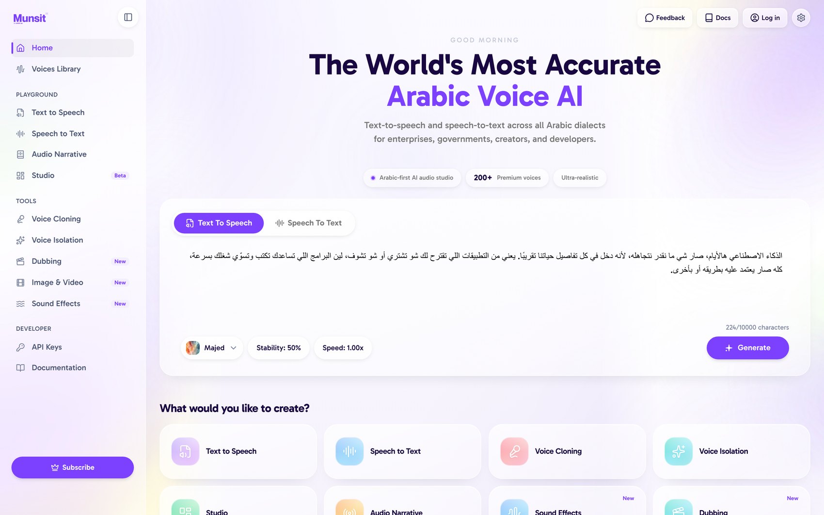
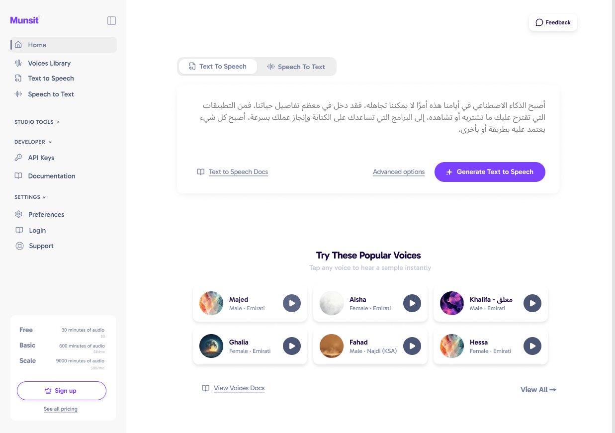
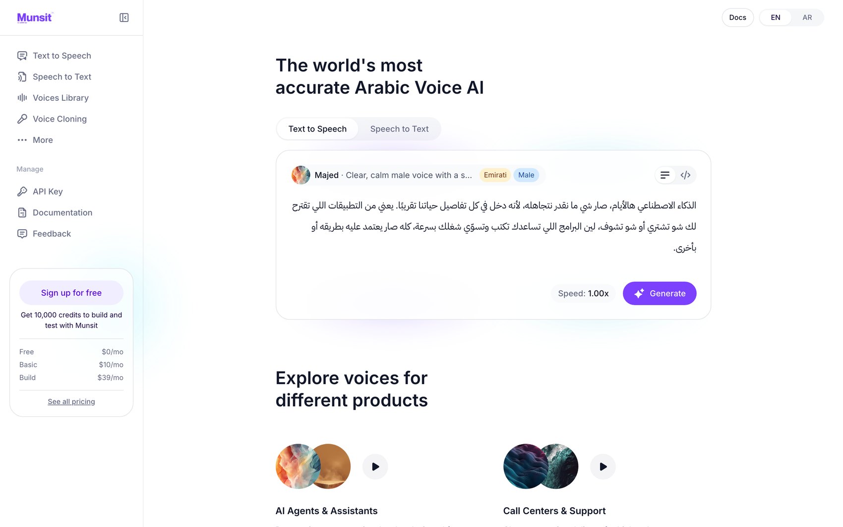
| Element | Before | Zurb · 21 Aug | Live |
|---|---|---|---|
| Hero headline | Display scale | Removed | Present, reduced scale |
| Sidebar | 13 items, flat | 4 primary + disclosure | 5 primary + More |
| Feature entry points | 8 tiles, equal weight | Popular voices grid | 3 use-case sections |
| Plan & pricing | Floating button | Plan card | Persistent panel + free credits |
Authentication
Proposed by Zurb in the first round and carried through to production.
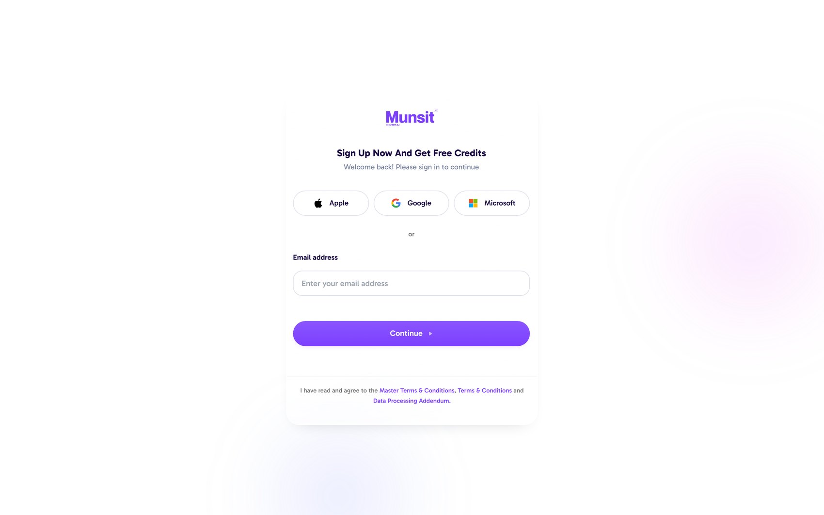
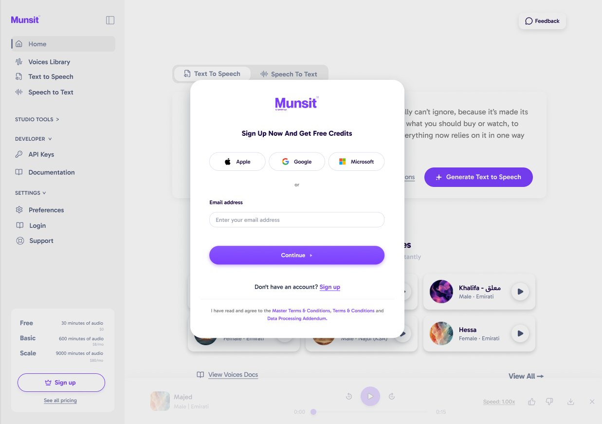
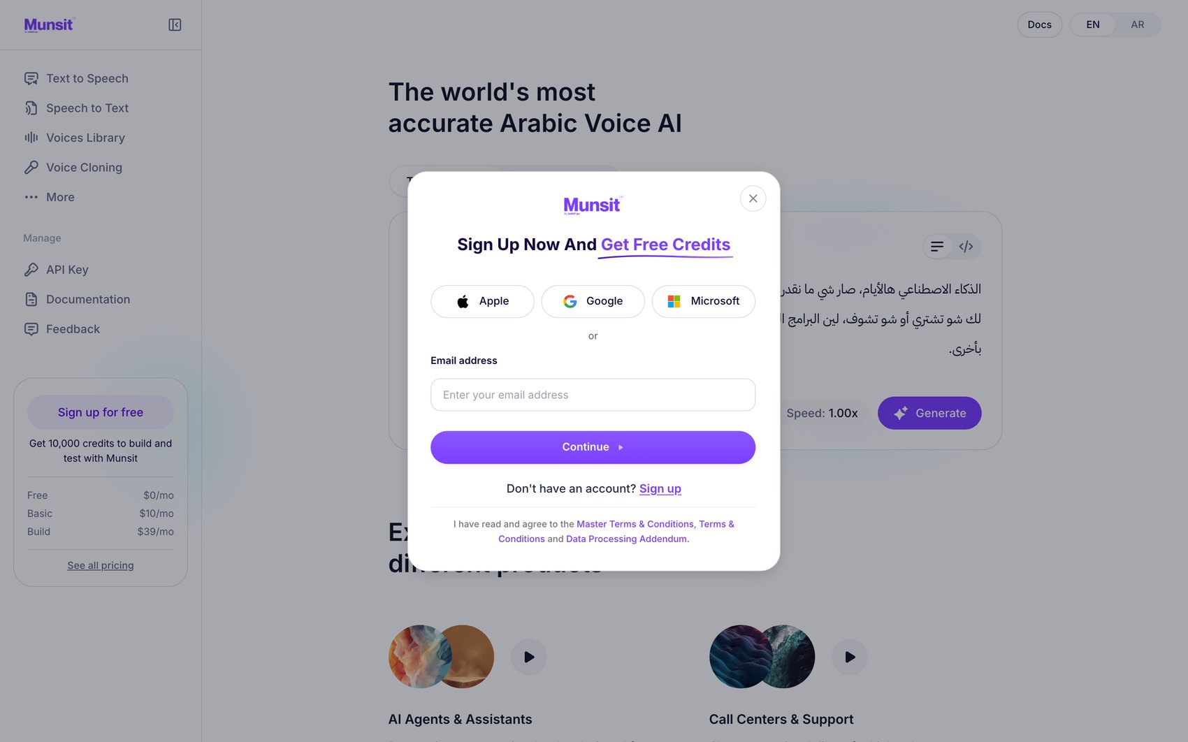
| Element | Before | Zurb · 21 Aug | Live |
|---|---|---|---|
| Presentation | Dedicated page | Overlay, route unchanged | Overlay, route unchanged |
| Context behind | None | Dimmed page, player visible | Dimmed page |
Voices Library
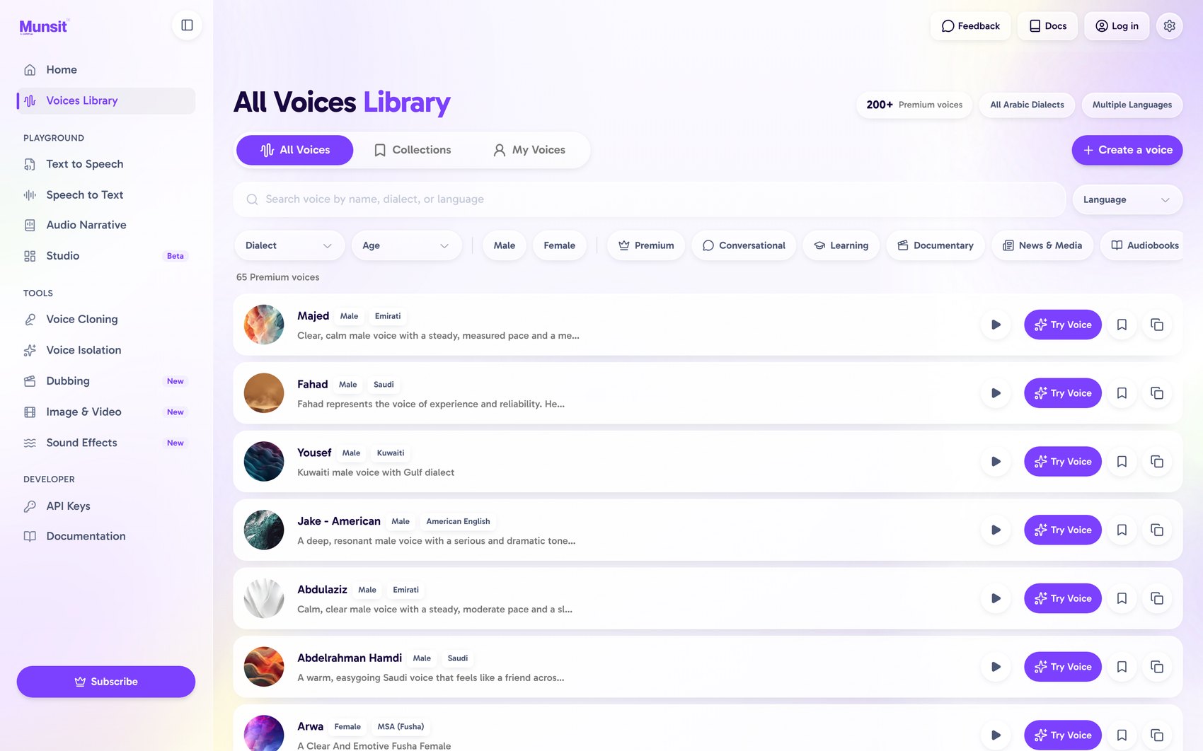
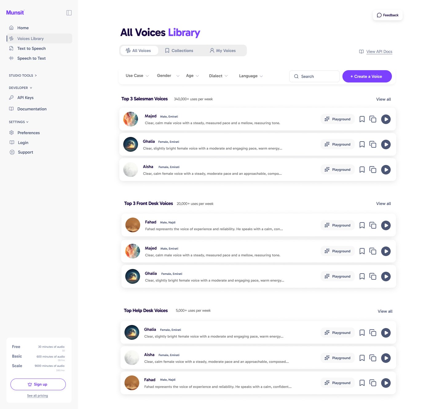
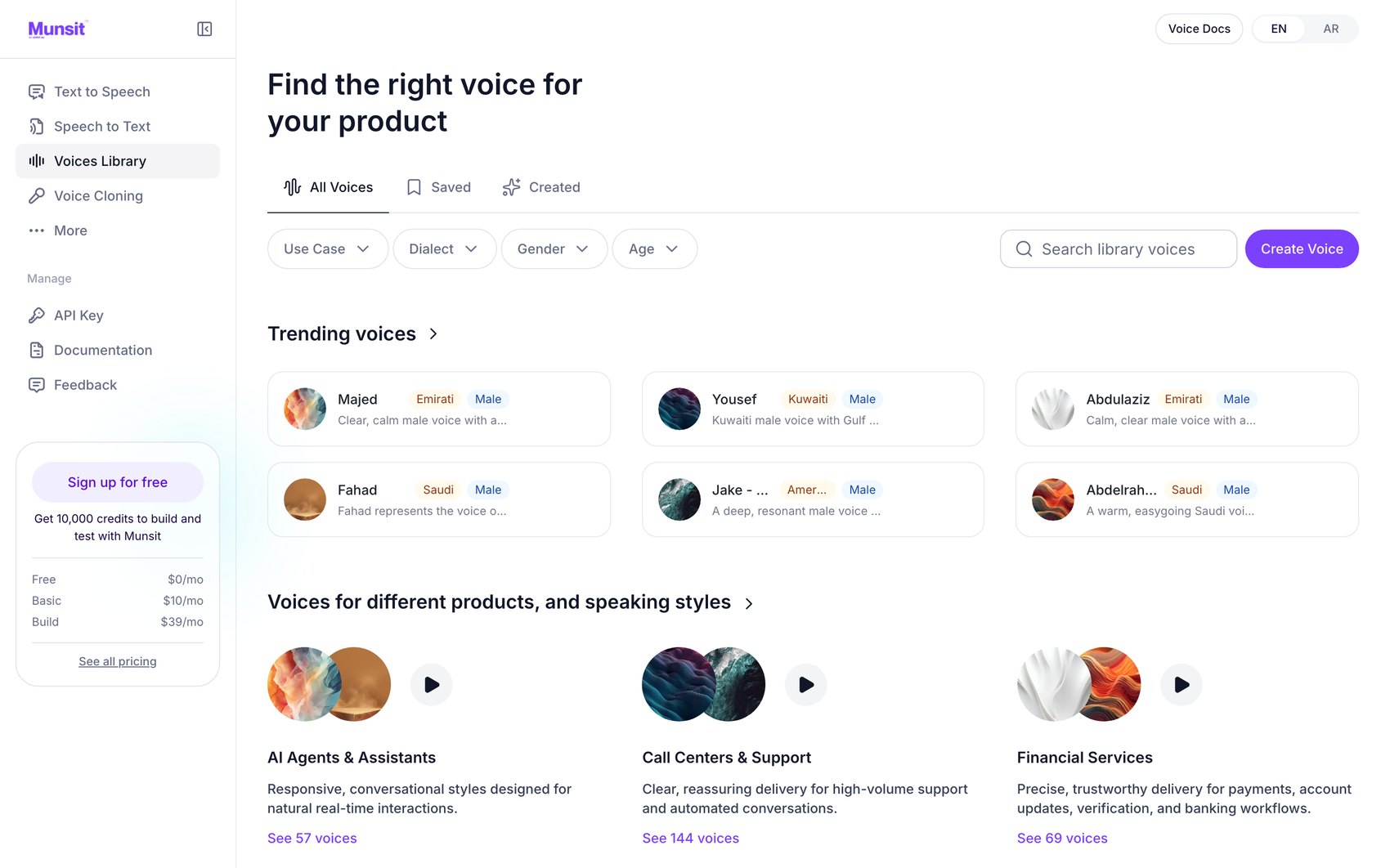
| Element | Before | Zurb · 21 Aug | Live |
|---|---|---|---|
| Organisation | Flat list | Grouped by use case | Grouped by use case |
| Group labels | — | Salesman · Front Desk · Help Desk | AI Agents · Call Centers · Financial Services |
| Filters | 11 chips | 5 dropdowns | 4 dropdowns |
Text to Speech
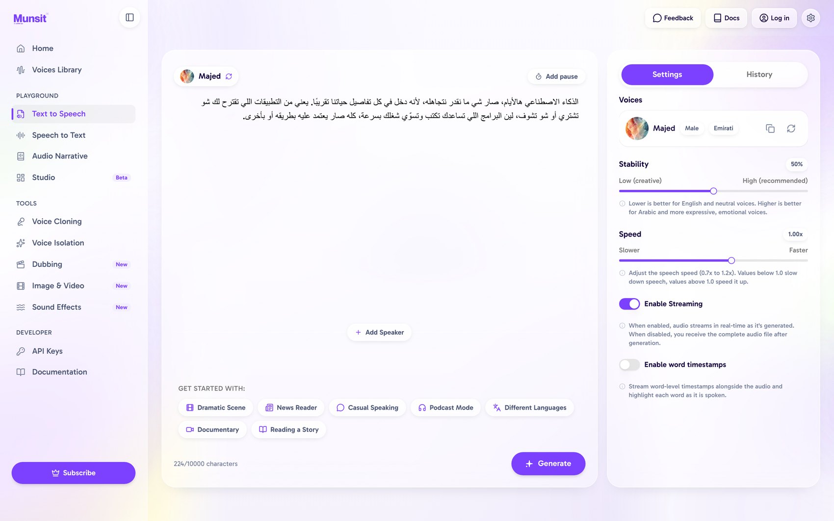
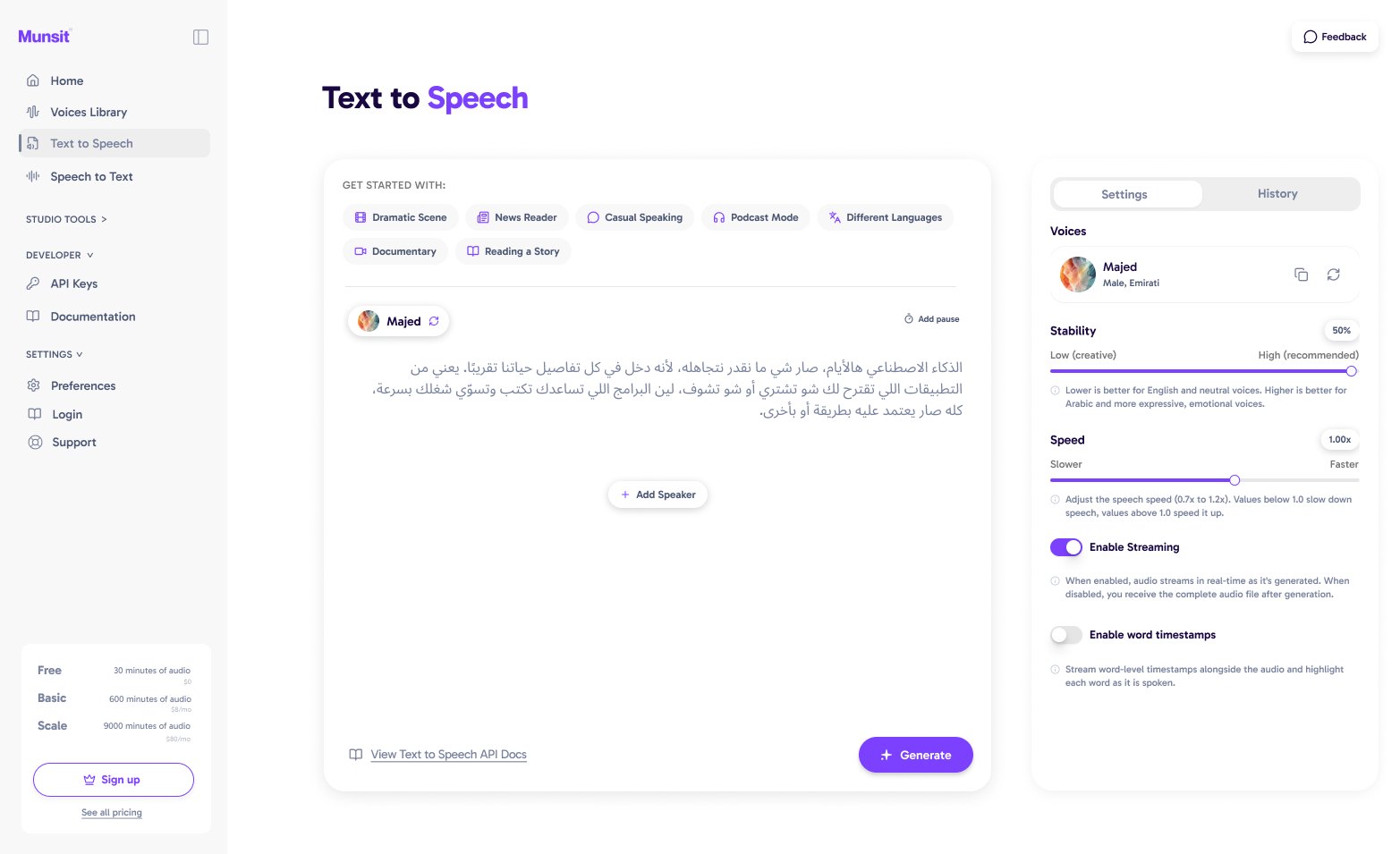
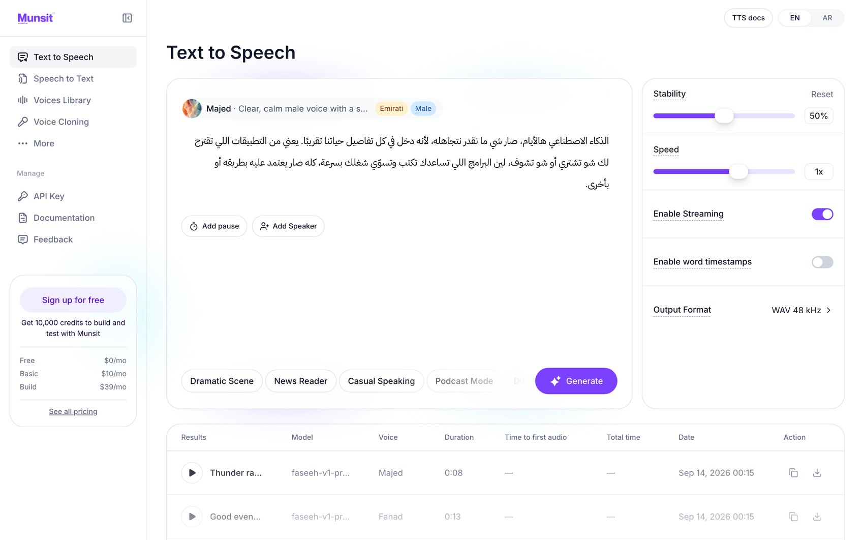
| Element | Before | Zurb · 21 Aug | Live |
|---|---|---|---|
| Settings guidance | Full paragraphs | Full paragraphs | Underlined hint targets |
| Output format | Not exposed | Not exposed | WAV 48 kHz |
| Generation results | History tab | History tab | Table with time to first audio and total time |
| Documentation | Not on screen | In-page link | Header link |
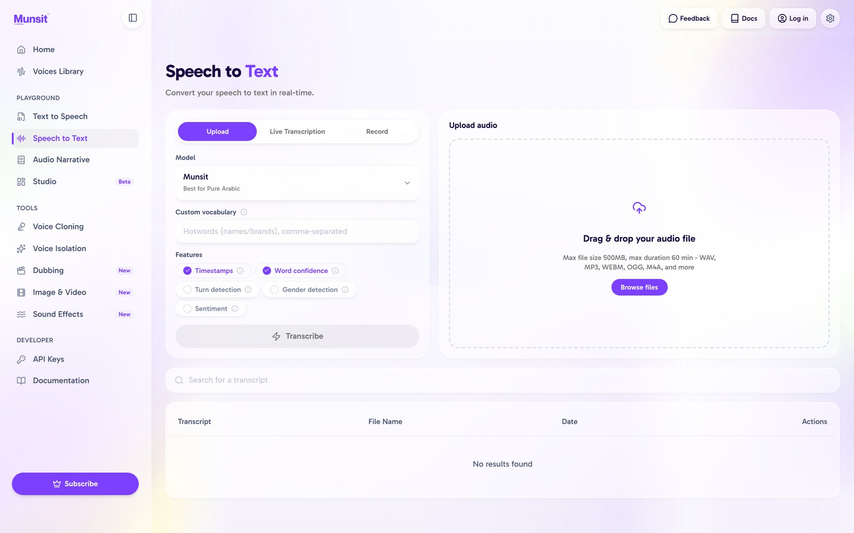
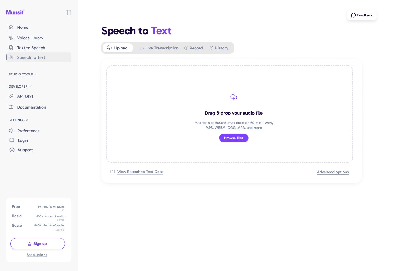
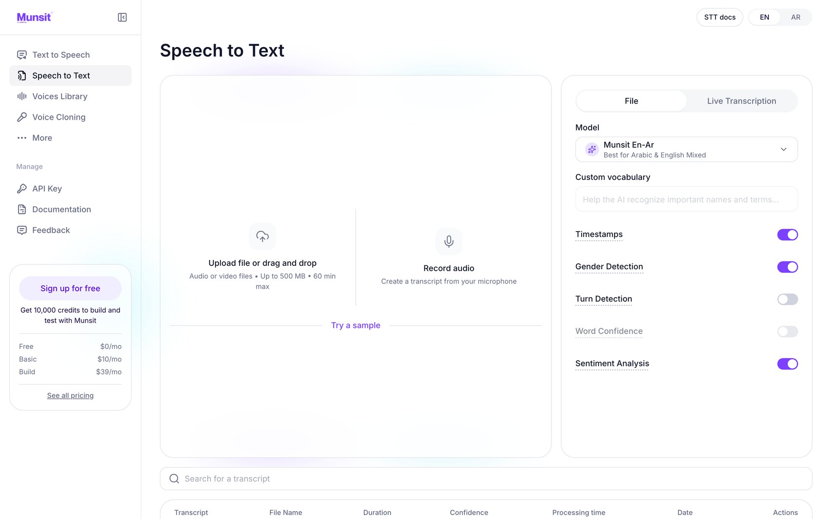
Speech to Text
| Element | Before | Zurb · 21 Aug | Live |
|---|---|---|---|
| Primary action | Right column | Right column | Left, two large targets |
| Feature controls | Checkbox chips | Checkbox chips | Labelled toggles |
| Sample audio | None | None | Try a sample |
| Transcript table | Transcript, file, date | — | Adds duration, confidence, processing time |
05 — First round
What Zurb delivered before 21 August
Four directions, each carried across six screens; the home page of each is shown. All four explore page architecture, working within the component set of the existing application.
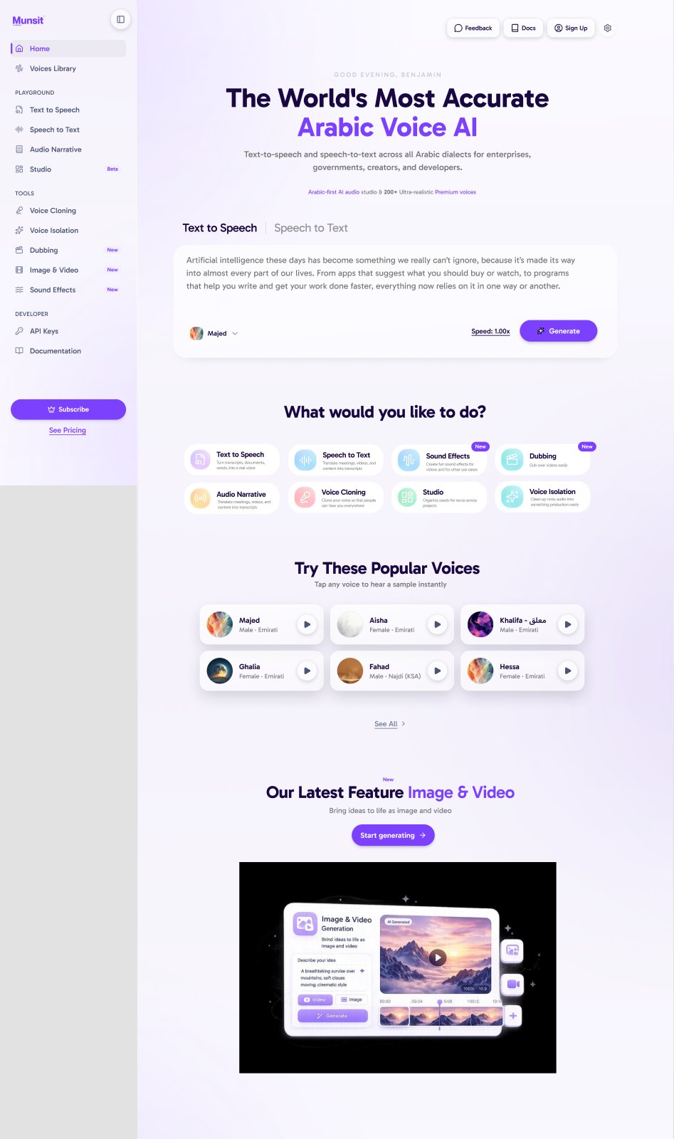
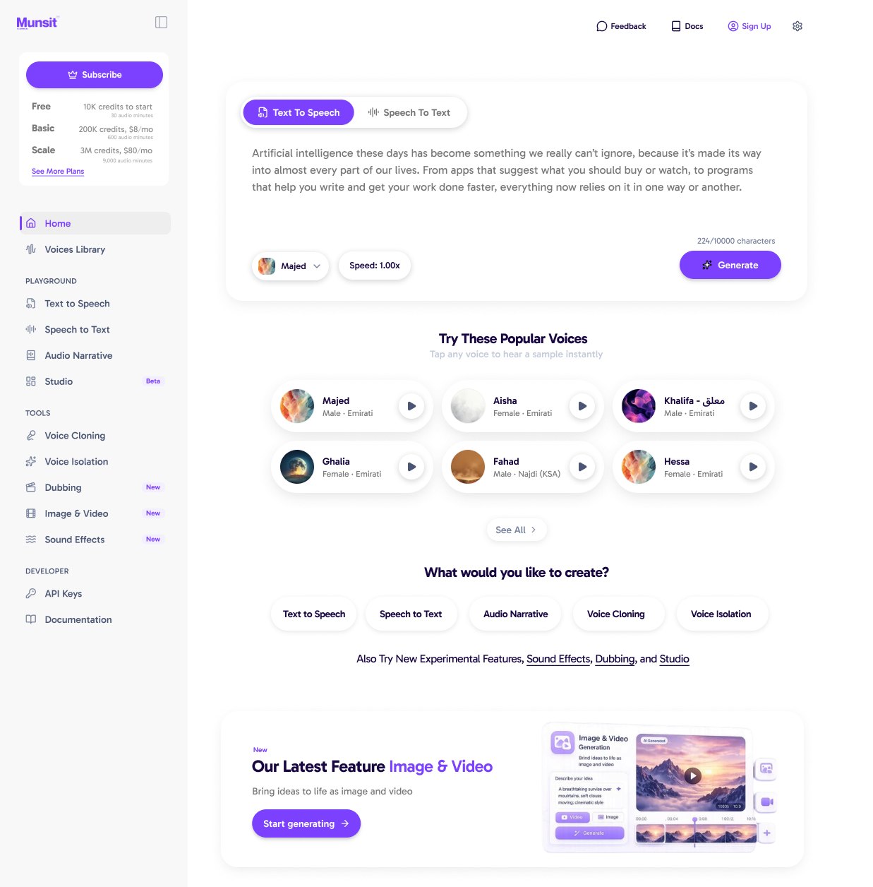
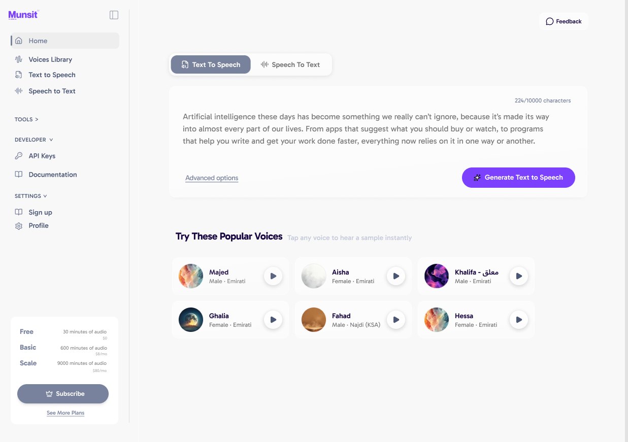
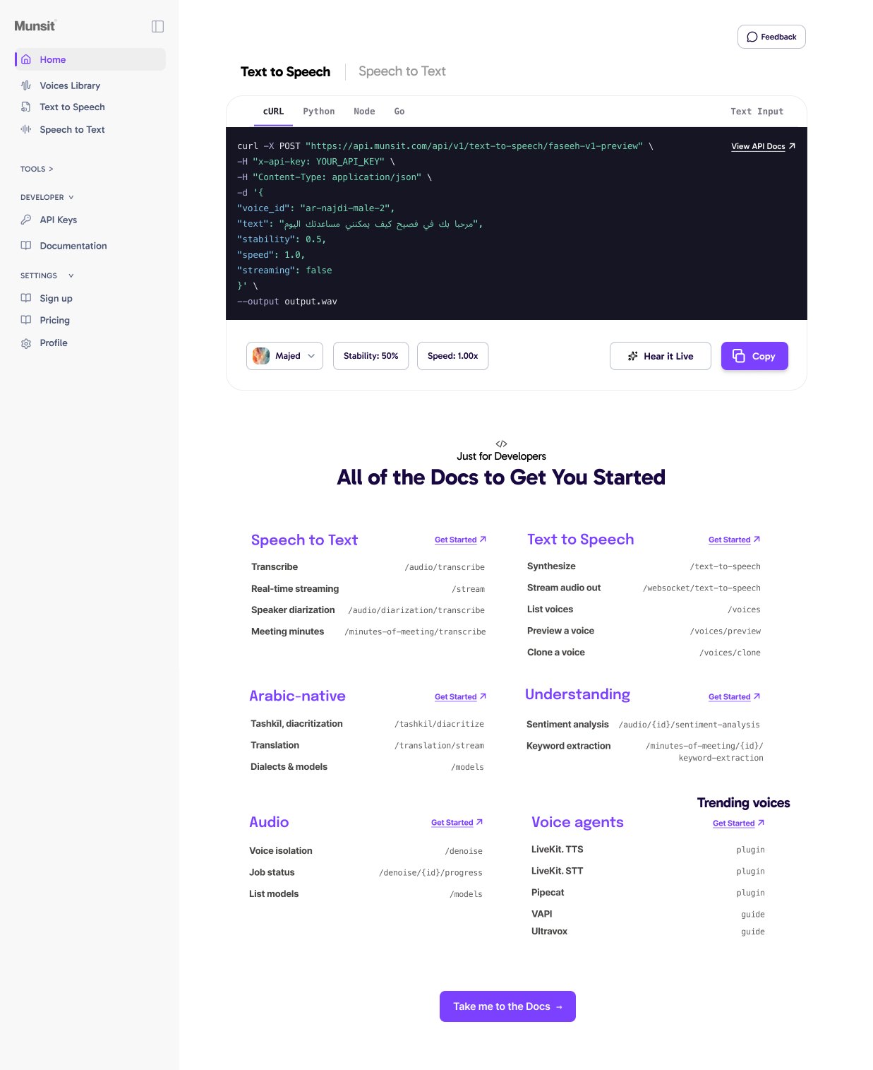
Roughly twenty-four production-fidelity frames produced in fifteen days, concurrently with the audit and user testing.
06 — Holding the date
Munsit engineering delivery
Nine secondary screens. Voice Cloning, Voice Isolation, Dubbing, Image & Video, Sound Effects and API Keys were never covered by Zurb at any stage. Studio, Audio Narrative and the account screens existed only as concepts, none production-ready. With no designer available inside the remaining window, Munsit engineering carried all nine directly against the agreed design system, so the whole application shipped in one visual language.
The full build in three days. Between 28 August and 1 September, Munsit engineering implemented the complete revamp — every screen, both locales, right-to-left throughout — absorbing design refinements as they arrived rather than building to a fixed set. Handed to Applause on 1 September; results returned 4 September, defects resolved, live the same day, on the date committed.
07 — Measurements
The two builds, measured
| Property | Pre-revamp | Live |
|---|---|---|
| Distinct type sizes | 9 | 4 |
| Distinct corner radii | 7 | 5 |
| Visible shadow recipes | 8 | 0 |
| Rendered elements | 572 | 260 |